Yield Curve Steepening: Expected Inflation vs. Real Rates (or Something Else)
Source ↗
👁 0
💬 0
Big jumps in yields; as shown at the five year maturity, the move is evident in both nominal and real yields:
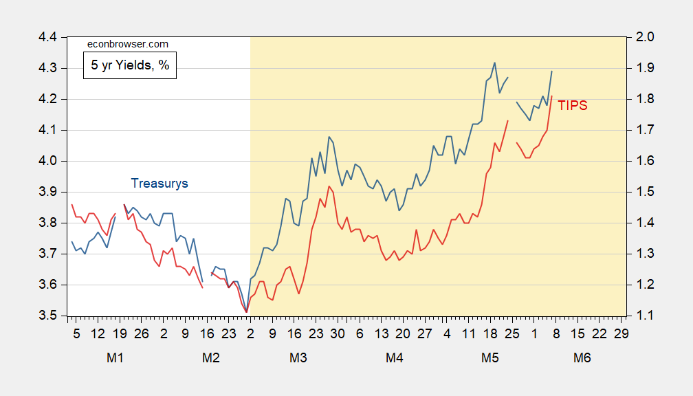
Figure 1: Treasury 5 year yield (blue, left scale), TIPS 5 year yield (red, right scale), both in %. Source: Treasury via FRED.
What is notable is that this is not a recent peak in the nominal yield, but it is in the real yield. This suggests not upward revision primarily in inflation expectations, but rather in real yields (higher economic activity leads to greater demand for credit)

Comments (0)