🏛️ Architecture & Design 4d ago · Jonathan Bell

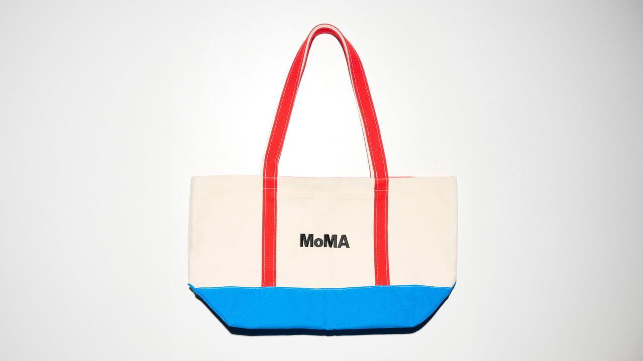
Anatomy of a logo: MoMA by Ivan Chermayeff
Wallpaper Magazine
View Channel →
Anatomy of a logo: MoMA by Ivan Chermayeff
Source ↗ 👁 0 💬 0
Ivan Chermayeff’s MoMA logotype first surfaced in 1964, making effective and appropriately modern use of Franklin Gothic No. 2 to create a starkly typography approach. Chermayeff, son of the modernist architect Serge Chermayeff, worked across graphic design, branding, writing, and design theory, creating logos for Barneys New York, Chase Bank, New York University and many other American institutions. A custom typeface by Matthew Carter, MoMA Gothic, was introduced in 2004 and five years later Pe


Comments (0)

Sign in to join the discussion

More Like This

BT Tower plans unveiled: what’s in store for the Grade II-listed icon?
Latest from Wallpaper · 1h ago
Jil Sander expands her Thonet furniture collaboration, an ode to the Bauhaus
Latest from Wallpaper · 1h ago
China’s New Coastal Installation Looks Like It Belongs in Space
Yanko Design · 2h ago
Two new portable projectors from XGIMI combine high performance with convenience
Latest from Wallpaper · 2h ago
At $270, ASUS’s New Chromebook Has No Business Being This Good
Yanko Design · 3h ago
Motorola Just Built the Android Phone Samsung’s Galaxy S26 Almost Was
Yanko Design · 4h ago